'If you want to go and see Ronald Searle-and nothing is more interesting than visiting an artist in his own surroundings-then you must fly to Provence in the South of France. In the little town high up in the hills, the tall, lean houses are closely packed together along the narrow streets. . . for several years Ronald Searle has lived and worked here in one of these houses full of nooks and crannies. Only the roof terrace yields a view over the Provençal hills; in the distance is the characteristic silhouette of Mont Sainte Victoire, the mountain Cezanne painted so many times. The house itself looks inwards. The view from the studio is blocked by the walls of the house opposite. When he stands at his long drawing table- penning curlicues or working on the design for a new medal, Ronald Searle is alone with himself and his imagination.'
from Henning Bock's introduction to
Ronald Searle, 1978 Mayflower Books NY

Quite fittingly, Ronald Searle, illustration god, lives in a Provençal mountain village described on the sign as the
'village in the sky'. Also designated
'un plus beaux villages de France', to reach it means a winding yet pleasurable drive through rolling farmland & vinyards; off the beaten track but picture postcard perfect.
The Searles have lived there now for 30 years & as he told me they
'love it!'
It's allowed him a measure of anonymity (although everyone in the village seems to know him!) much cherished after a 30 year career in the international spotlight-throughout the 50s & 60s Searle was Britain's best known illustrator & his reputation lingers of course. However he longed to escape the repetitiveness, pressure & travelling of reportage illustration, finding in France a refuge & a chance to breath. Far from retired he has continued editorial illustration regularly for the
New Yorker in the 80s & 90s and for
LeMonde since. He has branched out into relief sculpture with a series of coins for the French mint & still accepts authors' requests to illustrate their books.
Most recently Jeffrey Archer's
'Cat 'O Nine Tails' and Robert Forbes
'Beastly Feasts'published last year.
These were among many topics that were discussed when I recently had the opportunity to visit Mr Searle & ask him about his art & career.

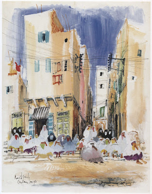
I kicked off the conversation asking him about the pictures he made in Morocco in 1965 which I had found intriguing in their uncharacteristic technique. They're much more painterly than his usual output, almost devoid of drawing in fact & apparently unpublished. He said they were his last assignment for
HOLIDAY magazine before the magazine folded. Painted on the spot in watercolour he worked at a distance from the subject matter
'to avoid too much attention.'

Like most artists Searle prefers to draw without disturbance from an audience, remaining a passive observer, preferably without being noticed. For this sketch in a german pub he sat at the back & drew while everyone's attention was on the television set.

He looks fondly on his time as a roving illustrator for
HOLIDAY magazine, jetting around the world on assignment. The magazine would pay for first class travel but he traded the ticket for two in economy allowing Monica his wife to accompany him.

He told me she would cover the trips with a polaroid camera-('the latest thing back then') which he could refer to later in case he missed any details.
'HOLIDAY would say go to Alaska & bring back 30 drawings' so off they'd go to the first location, sketch then back to the hotel to work up finished drawings, sleep, then the next day move on to the next location.' They did this for 6 months of the year for almost 15 years. It was so cold in Alaska that the ink literally froze in his pen! Consequently he did most of his sketches there in pencil.

He remembers
HOLIDAY art director Frank Zachary as
'a marvellous man' & remains grateful for the opportunity to visit all corners of the world, covering Florida, New York, Germany, Spain, Hawaii amongst others.
'I'd never been to Palm Springs!'
The magazine had a lavish large format with full colour & it's something to open up an issue & see Searle's drawings reproduced almost life size. They're much better viewed this way than in the later collected reprints. For its time the production values were very high. Searle revealed to me that the magazines' printers invented an ink they christened
'Searle purple' to capture the correct hue of the ink that he used.

Searle's drawings from his trip around Germany for
HOLIDAY were later reprinted in Heinz Huber's
'Haven't We Met Before?' Huber had been friends with the artist since he had invited him to appear on German television while working in the industry in the 50s. Searle would later ask him to return the favour and accompany him on his trip around Germany as his guide & talked him into writing the text of the book.

Searle also did reportage for
LIFE magazine during the 60s, illustrating articles that were more serious in tone than for
HOLIDAY. Known for its extensive photo library Searle believes the magazine had events so well covered photographically that they used him just to get another perspective.
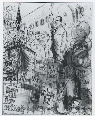
In 1960 he went on the campaign trail years before Ralph Steadman & Hunter S Thompson, chronicling the presidential race between Nixon & Kennedy, spending time trying to get close enough to both to capture their likeness.

The 1961 trial of war criminal Adolf Eichmann proved to be a trial for Searle too as sketching was not permitted in court. He encountered the same obstacle when sent to draw at the Old Bailey in London. He got around this by surrepticiously drawing on tiny note paper in his lap & taking multiple loo breaks! He would memorise a feature, leave the courtroom & make rapid sketches from memory. With only a week's deadline to collate the necessary research the Old Bailey assignment turned out to be much effort for little renumeration, 'at least the Eichmann trial went on for months!' he joked.

Searle's sketching assignments often brought him close to the powerful & famous. As a teenager in his native Cambridge he had sketched Winston Churchill orating at the Guildhall for the local newspaper. His press credentials allowed him to sit in the front row where Churchill saw him sketching & later signed the drawing (Churchill was a keen amateur artist himself).

On a visit to Poland in 1948 he almost met Picasso. The Spanish artist was invited to the country as an honorary guest of the
World Congress of Intellectuals For Peace. Searle was there partly to see Auschwitz for himself when he heard about the congress. Accompanied by that other great reportage draughtsman of the 20th century,
Feliks Topolski, they went along in the hope of meeting their idol. However they found him beseiged by a throng of like-minded admirers. Their encounter lasted
'a second'!

Searle's reputation as a draughtsman also got him involved in an international political situation-the Suez Crisis of 1956. He was placed under the Official Secrets Act and
'requested' by the War Office to take part in a 'mission'. Stationed at Suez Operations HQ in Cyprus he was part of a five man team in the Department of Psychological Warfare.

Unable at the time to tell even his wife where he was going he seemed still reluctant to discuss details. Serving seven years in the army during & after World War 11 meant he was qualified as a military man but he refused to re-enlist & chuckled at the memory of being the sole artist in a group including an SAS commander & a pilot. These rare propaganda pamphlets are hard to find these days except probably in Egyptian flea markets!

He spent much of the following year in America working in Hollywood on an animated industrial film for Standard Oil. The 1O minute short
'Energetically Yours' was produced by Playhouse Pictures, directed by David Hilberman with Searle hired to design and storyboard.
I mentioned that I deemed it probably the finest example of Searle's style translated to animation, streets ahead of the later
Dick DeadEye which Searle agreed was 'disappointing'. However he told me without hesitation that Brit animator Ivor Wood (who would become best known for stop-motion TV show Postman Pat) had captured his style best.

Here he unearthed for me an unknown chapter of animation history. While collaborating on some commercials for another oil company they concocted an idea to pitch non-commercial ads; mini artistic shorts, that would air between commercials! Needless to say this never flew with TV execs but apparently the spots were produced & now languish in Searle's archives. I hope to persuade him to dig these out sometime.

It's well known that during his stay in Hollywood Searle was invited on a tour of the Disney studios & posed for publicity shots with the great man himself. I asked him about the story of seeing 'his horse' on the walls of Tom Oreb's office & how much he thought the Disney artists were influenced by his art & others of the
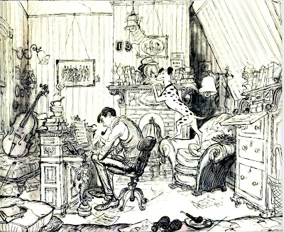
'Lilliput' school. Searle dismissed this saying the top animators came from newspaper/magazine illustration themselves & had long developed their own style before he came along. Although he did acknowledge that Ken Anderson directly sourced the Searle style as a key influence on the look of
101 Dalmations. Anderson was among several of the Disney artists that Searle remained friends with despite not warming much to their boss. He was invited to their homes for evening parties & must have been very much part of that social scene.

Another ex-Disney artist he holds fond memories of is Bill Tytla. I was surprised to find out that he had worked with him at his commercial studio in New York-presumably the studio founded by him & Ray Favata in the late Fifties.
Naturally, he also got to know the UPA artists too, Hilberman of course & Art Babbitt would later produce the animation for
Energetically Yours at Playhouse Pictures, along with Bill Melendez who went on to produce
Dick Deadeye based on Searle's designs.
The Fifties must have been Searle's busiest decade, in his thirties, still with the energy & drive to accept any commission from reportage to animation, decorating the
Chelsea Arts Ball to film posters & theatrical design. Travelling the globe on assignment & even top secret missions! What's more impressive is was also simultaneously running his own publishing company!
PERPETUA (which is where this blog takes its title) was founded by him and Kaye Webb his first wife who he met in the offices of
LILLIPUT magazine & would later go on to further success as editor of Puffin books.

They not only published beautiful editions of Searle's work but also volumes on Cezanne, Toulouse-Lautrec & André Francois. The graphic design of the covers of Perpetua Books are striking-all usually typeset in Searle's distinctive font. I was curious to know whether he had a team working for him or at least an assistant to do the books layout? But he said no, just him-he did it all!
Only a couple of titles were successes and the company didn't last but the presentation of Perpetua editions endures with their distinctive red, black & white covers.


The
PERPETUA bookcovers led us back to discussing illustration & political cartooning which I'll save for part two!
(I'm grateful to Shane Glines for contributing high quality scans)


 The image above is not a Christmas cover but it has a winter feeling. It's a nice companion piece to the following image.


