'A Trip to the Seaside' for Lilliput Magazine 1947
'Festival of Britain' for Punch magazine 1951
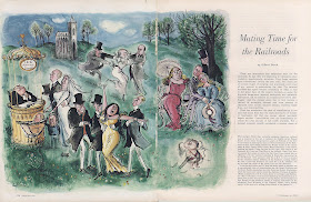
Searle mastered these intricate tableau colour spreads. It's a joy to scrutinize the details of these pictures.
Fortune magazine 1956
Fortune magazine 1961
The 'red sky at night' of the Punch cover above contrasts beautifully with the almost turquoise grass.
It may have inspired the colour palette of the next piece but it was actually published the year after so unlikely. Compare this seaside image with the Lilliput piece a decade earlier-Searle's stylistic range is remarkable.
Punch 14th August 1957

.jpeg)
.jpeg)
.jpeg)
.jpeg)


No comments:
Post a Comment