To mark Ronald Searle’s 90th birthday, the Cartoon Museum is showing a retrospective of his work. Here, Louis Hellman examines Searle’s portrayals of architecture and art
Cartoonists invariably need to include buildings or townscapes in their drawings and do it with varying degrees of understanding. Some, such as Giles or Steve Bell, generally get the details right, but how often have we seen particularly inaccurate representations of the Millennium Dome or the Gherkin?
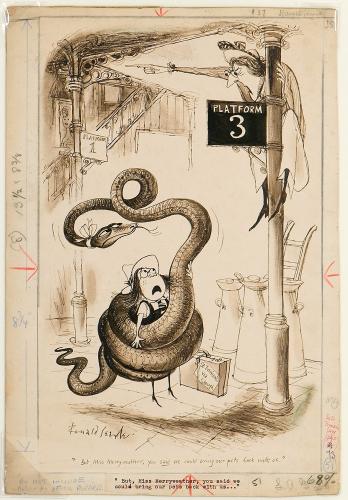
Ronald Searle, arguably the greatest 20th-century English cartoonist and still going at 90, worked as an architectural draughtsman for the Royal Engineers at the outbreak of the Second World War. His depictions of buildings range from accurate representations to surreal fantasies and his architecture, whether real or invented, often complements the drawing style of his neo-rococo figures.
Searle was incarcerated in a Japanese prison camp during the war, where he drew the surrounding atrocities on scraps of paper scavenged by other prisoners. After the war, he achieved popularity with his creation of the subversive St Trinian’s schoolgirls, and he subsequently found international fame through illustration, graphic reportage and cover design.
Searle, the cartoonists’ cartoonist, has influenced practically everybody, whether they are aware of it or not. He developed his mature style in the 1950s along with his contemporaries Saul Steinberg, André François and George Grosz, with each of whom he has clear affinities. Searle’s brilliant impromptu draughtsmanship, always searching, unfolding, exploring and rooted in the 1950s and the English tradition, is deceptively whimsical at first sight. But the superficial attractiveness conceals the barb of satire or disapproval, in contrast to today’s more in-your-face satirists.
Born in Cambridge, Searle has lived in France since 1961, where he is appreciated, exhibited and recognised as an important artist. Rightly so.
Entrance to Old Medina, Casablanca, Morocco, January 1965This scene was painted for the US magazine Holiday and exhibited at the Bibliothèque Nationale de France in Paris. It exemplifies Searle’s free pen-and-wash reportage approach, combining straight representations of buildings with caricatured people.
Al Fresco, 1977
Searle invents a spidery classicism as a setting for his rococo surrealism and naughty nudes in a superb composition. As Russell Davies observes in his 1990 biography of Searle: ‘Within even the craziest of his drawings, the beautiful correctness of observed reality still ruled. He was not making the world look funny, but experiencing it as funny; it was less a style than a psychological condition.’ Note the flicked blots, a technique possibly borrowed from upstart Ralph Steadman. Searle’s original 1950s style was clearly tempered by the new graphics.
New York, circa 1957When Searle first visited New York (he would later be published in the New Yorker) he stayed in a hotel next to the United Nations building.
His window offered fascinating views of nearby skyscrapers and what the locals got up to on the rooftops below. He produced a number of so-called ‘on the spot’ studies, which he claims ‘look elaborate but in fact they don’t take all that long to draw.’ Oh, really! But did those post-modern-ish blocks actually exist or were they Searlian inventions?
A Bigger Slash: Hommage to David Hockney, 1984This lithograph refers to David Hockney’s famous A Bigger Splash (1967), one of a series of poolside paintings executed when the artist lived in California. But is it a ‘hommage’ or a piss-take prequel? Are these other artists raining on Hockney’s paradise or members of the philistine public? And where has the diver come from? Best not to analyse, it’s just very funny.
The Ruhr, 1963Another example of Searle’s reportage drawings as he toured industrial Europe in the 1960s for Holiday and Fortune magazines. This awakened an early and prophetic environmental concern - the industrialist smells the flower, unaware that his enterprises are the cause of the destruction of nature. The cartoonist Marc Boxer criticised Searle in the 1970s for forsaking being funny for being ‘meaningful’ and preachy, and this cartoon might be trite by today’s standards. But, as ever, the drawing makes up for its period timidity. Has he got the German flag wrong though?
Los Angeles, 1957In 1957, Searle continued his association with the journalist and novelist Alex Atkinson with a series of features for Punch on America, a gentler version of the future collaboration between Hunter S Thompson and Ralph Steadman. It appeared in book form as USA for Beginners (by Rocking-Chair Across America). Here, Searle’s sweeping baroque lines conjure up a boulevard entirely composed of mortuaries of Las Vegas ostentation. The whole fantasy seems in the grip of some ghastly graphic growth hormone, including the carbuncular rococo automobile.
Louis Hellman has been contributing cartoons to the AJ since 1967

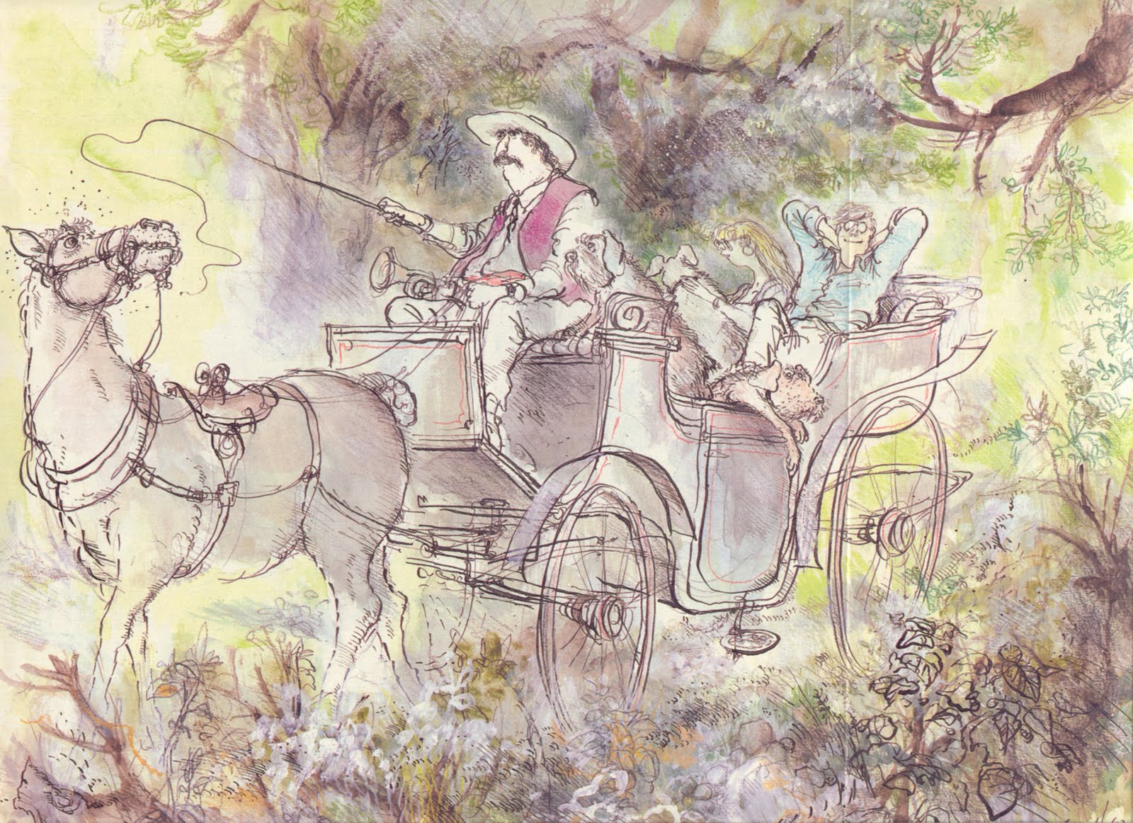
 A second volume of Robert Forbes' poems is to be published in the autumn again illustrated by Ronald Searle. Let's have a Bite! will be available soon from Overlook Press. They previously collaborated on Beastly Feasts!